About the Project
-
ClientLabrynthian Minds LLC
-
Year2018
-
RoleUX Designer
-
Project GoalDeliver a sophisticated, user-centered beauty tutorial experience without sifting through irrelevant videos.
Executive Summary
Goal:
The primary objective for the "My Beauty Tube" mobile application was to create a user-centric, intuitive platform that delivers professional beauty tutorials without irrelevant, distracting videos that do not pertain to the beauty industry. The aim was to cater to the discerning needs of beauty enthusiasts and professionals seeking reliable and high-quality instructional content on their mobile devices. Emphasis was placed on the core functionalality and design for an accesible, intuitive, and inclusive user experience.
Solution:
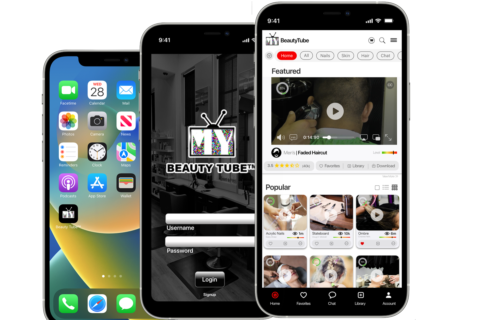
In addressing the challenge of delivering a premium mobile learning experience for beauty enthusiasts, the "My Beauty Tube" iOS application was developed as a comprehensive solution that seamlessly integrates educational content with a user-friendly interface. The application serves as a marketplace and learning platform for every level of skill, offering a curated selection of high-quality beauty tutorials from industry professionals.
Design Process
Step 1: Reasearch
Personas
Firstly, we delved into creating detailed personas. This process involved synthesizing data from various sources to construct representative profiles of our primary users: aspiring and practicing cosmetologists. These personas helped us to visualize our users’ goals, challenges, and what they sought in a learning platform. It became clear that both groups prioritized learning from licensed professionals over navigating through amateur content.

-
Rebecca Contania
- Female
- Age 32
- Some Cosmetology school
- Occupation: retail clerk, baby sitter, Uber driver
- Since she left beauty school early, she’s been searching for the perfect place to keep learning so when she goes back she can hit the ground running. She wants an app where she can find expert tutorials without having to sift through endless amateur videos.
- Background: She doesn't have a lot of work experience expecpt uber. She started beauty school but because of being on her own, she could not afford to school anymore, but plans on returning.
- She has limited knowledge of apps and how to use the computer.
- What matters most to Rebecca is that she continue learning from professionals so when she returns back to beauty school she will be able to find a job in a salon quicker right after she graduates.

-
Miguel Lopez
- Gender: Male
- Age: 34
- Occupation: Single Parent, IT Professional
- Background: Miguel is a single dad with a keen interest in learning different braiding styles for his daughter's hair. He values spending quality time with his child and sees hairstyling as an opportunity to bond. With a busy work schedule, he seeks convenient and easy-to-follow tutorials to enhance his braiding skills.
- Goals and Needs:
- Learn various braiding techniques suitable for different occasions. Find tutorials that cater specifically to inexperienced people. Access content any time and that fits into his schedule as a working parent.
- Challenges: Limited time due to work and parenting responsibilities. Lack of experience in hairstyling.
- Motivations: Strengthen the bond with his daughter through creative activities. Gain confidence in hairstyling to provide diverse looks for special occasions.

-
Sarah Brittman
- Gender: Female
- Age: 28
- Occupation: Licensed Cosmetologist, Salon Owner
- Background: Sarah has over 10 years of experience in the cosmetology industry. As a salon owner specializing in color, color correction and trendy cutsl.
- Goals and Needs: Focused on expanding her clientele by learning and teaching her team a new straightening technique, aiming to increase revenue. Staying updated on industry trends and innovations is key for her. She prefers quick, direct advice from industry professionals when adopting new methods.
- Challenges: Navigating a busy salon schedule.
Finding time to learn new techniques to stay ahead of the latest trends.
- Motivations: Increase revenue for her and her employees Establish a network with experienced cosmetologists. Stay ahead of the trends.
Competitor Analysis
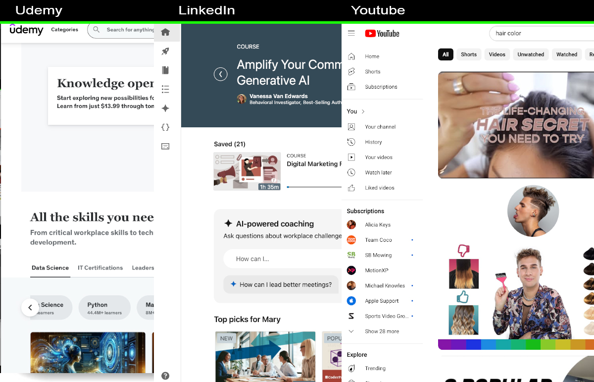
After gaining a clear understanding of our user personas, we next turned our attention to competitor analysis. Platforms like Udemy, LinkedIn Learning (formerly Lynda.com) and YouTube.com were scrutinized to identify gaps and opportunities. Our analysis revealed a scattered landscape of educational content, highlighting the need for a centralized repository of high-quality, professional tutorials. MORE DETAIL OF THE ISSUES
User Interviews
To validate and deepen our findings from the personas and competitor analysis, we conducted interviews with two key demographic groups: aspiring cosmetologists and professional stylists. The insights were enlightening. Both groups expressed a strong desire for a single platform offering direct access to professional, high-quality instructional content. Aspiring cosmetologists emphasized the importance of learning foundational skills from credible sources, while professionals sought to enhance their expertise with advanced techniques and new trends. The unanimous feedback underscored the necessity of featuring only content created by licensed professionals, making it a cornerstone of our project.

This foundational research stage—comprising persona development, competitor analysis, and user interviews—provided us with a clear directive: to design a platform that not only aggregates professional cosmetology tutorials but also fosters a community of learning and growth for both novices and seasoned professionals. It set the stage for a design process deeply rooted in user needs, guiding our decisions with the aim of creating an intuitive, enriching user experience.
Summary of Use Case Study:
summarize the key points that are needed and why we chose what we chose the features here1. Describe how the perspectives of Maria differ from your own? Maria's perspective differs from the researcher's in terms of her background and experience with technology. While the researcher is familiar with technology and computers, Maria has limited knowledge in this area. Additionally, Maria's approach to education and career differs, as she seeks online instructional videos after graduating from cosmetology school.
2. Based on the results of these tests, how can you improve the wireframes/architecture of your site for Maria? Maria's needs seem to be met with the search and menu bar. However, considering her limited experience with technology, it might be beneficial to provide more intuitive guidance on the site. Improvements could include clear tooltips or a brief tutorial on using the platform.
3. Based on this testing, what further testing should be done before finalizing your design for Maria? Retesting with Maria and similar individuals would be beneficial to ensure that any changes made are effective. Additionally, conducting usability testing with the target audience (cosmetology graduates with limited tech experience) during the beta phase can provide valuable insights.
4. If you were to create more personas for Maria, how do you think the test results would vary? Why or why not? Creating personas representing individuals with varying levels of tech proficiency could impact test results. For example, a persona of someone with advanced tech skills might navigate the site differently and have different preferences.
5. If you were to use actual people from the targeted audience(s) like Maria, how do you think the test results would vary? Why or why not? Using actual people like Maria in testing could reveal more nuanced insights. Observing their interactions without guidance might uncover challenges they face or areas where the platform needs further simplification for users with similar backgrounds.
Login/Homepage Wireframes
Simplicity in Design:
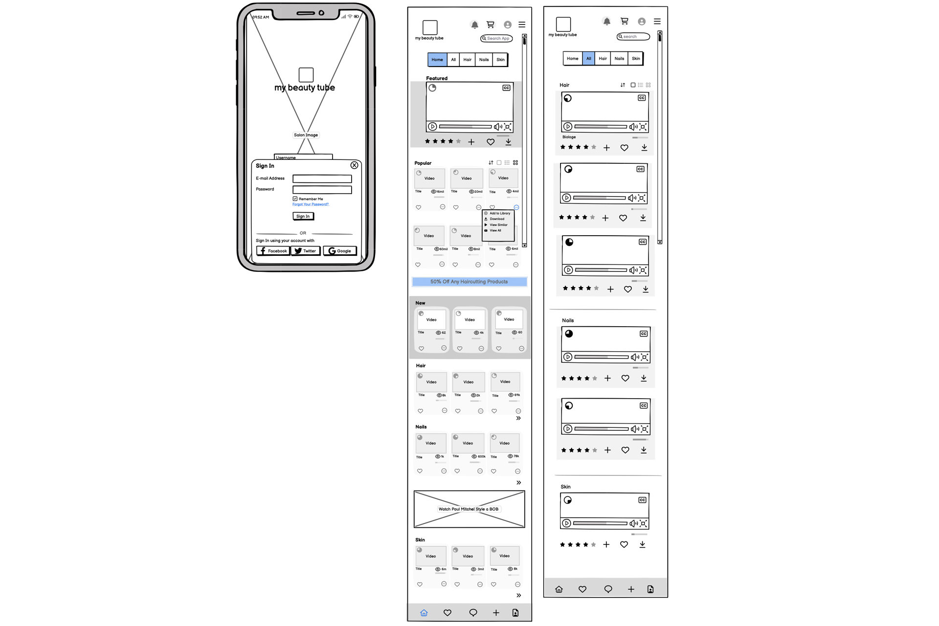
The login process has been intentionally simplified, mirroring the user-friendly interfaces of successful video platforms. This approach minimizes user effort and expedites access to content, aligning with best practices in UX design for user engagement and retention.
Navigational Efficiency:
The home screen employs a dynamic navigation bar that extends horizontally across the top of the interface, with an additional submenu on the left. This design facilitates easy access to various content categories, enhancing the user journey with efficient navigation paths.
Login Flow and Home Screen Design Overview
Featured Content:
Strategically placed at the top of the homepage, the changing featured video captures user interest immediately upon login, serving as an engaging entry point to the platform's rich content library.
Content Grouping:
Videos are thoughtfully categorized into sections like 'Popular', 'New Releases', and specific genres like 'Hair' and 'Nails'. This categorical arrangement supports user preferences and searchability, enhancing the content discovery process.
Progress Indicators:
Each video thumbnail includes a visual progress bar on the upper left corner, which not only indicates viewing progress but also subtly encourages users to complete watching videos, leveraging the psychological principle of completion.
Content Organization and Accessibility
User Interaction Tools:
Simple interaction tools like 'Add to Library' and 'Like' buttons on each video thumbnail allow for quick user actions, fostering engagement and personalization of the user experience.
Informational Cues:
Displaying the number of views, difficulty level, and an ellipsis menu for additional options (e.g., download, view all from creator, view similar content) on each video enriches the user interface with valuable contextual information, enhancing decision-making and engagement.
Adaptive Content Layout:
The use of different grid layouts for video displays adapts to various user devices and preferences, ensuring a responsive and flexible viewing experience. The strategic placement of advertisements between content sections also maximizes visibility without detracting from user engagement.
Research-Driven Design:
The design decisions for the login flow and home screen are backed by comprehensive user research. Insights gathered from user interviews, competitive analysis, and behavioral data have informed the placement, functionality, and aesthetics of each element on the home screen, ensuring the design meets the specific needs and preferences of the target audience.
Interactive Elements
Buying Process
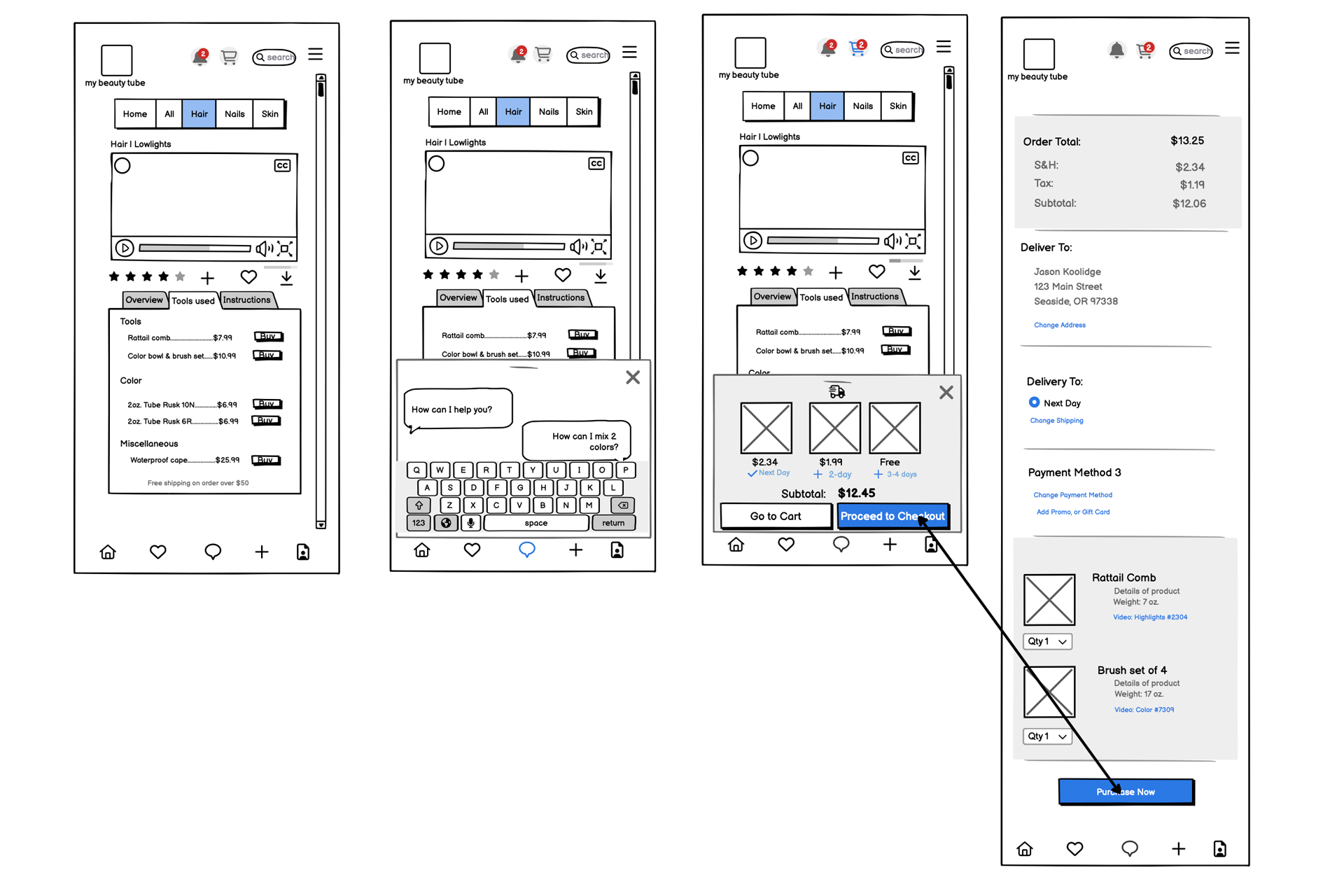
Designing the Buying Process Flow
As part of the initial launch of a My Beauty Tube tutorial platform, this wireframe series illustrates the buying process for professional tools and products showcased in instructional videos. The goal was to design an intuitive and streamlined purchase experience from the outset, informed by extensive user research.
Context
Integrated Tool Listings:
The "Tools Used" tab is prominently placed beneath the video player, where viewers can see a list of products used by the professional in the tutorial. This feature is designed to facilitate immediate and informed purchasing decisions, allowing users to buy items like shears and hairspray necessary to practice the techniques shown.
-
Simplified Interaction Design:
From the initial design phase, the focus was on creating a frictionless path to purchase. Users can add items to their shopping cart with a single click using a "+" icon adjacent to each product. This simplicity is crucial in maintaining engagement while watching the video and encourages spontaneous purchases by minimizing decision fatigue.
Streamlined Checkout Flow:
The checkout process is designed to be as efficient as possible. A single-page layout allows users to adjust quantities, enter shipping information, and finalize their purchase without navigating away from the page. This consolidation of steps was directly influenced by user research, which indicated a preference for quick and straightforward transaction processes in educational settings.
-
Direct Communication Options:
A chat feature connects users with a representative or the professional from the video for inquiries about the products or the tutorial content. This direct line of communication is intended to enhance customer confidence and support, aligning with the educational focus of the app.
Process and Decision-Making
Conclusion
This wireframe represents the foundational design choices for the buying process within our new educational platform. By integrating product purchases directly into the video learning experience and simplifying the transaction process, we aim to create an environment that supports seamless learning and interaction.
Account Order Flow
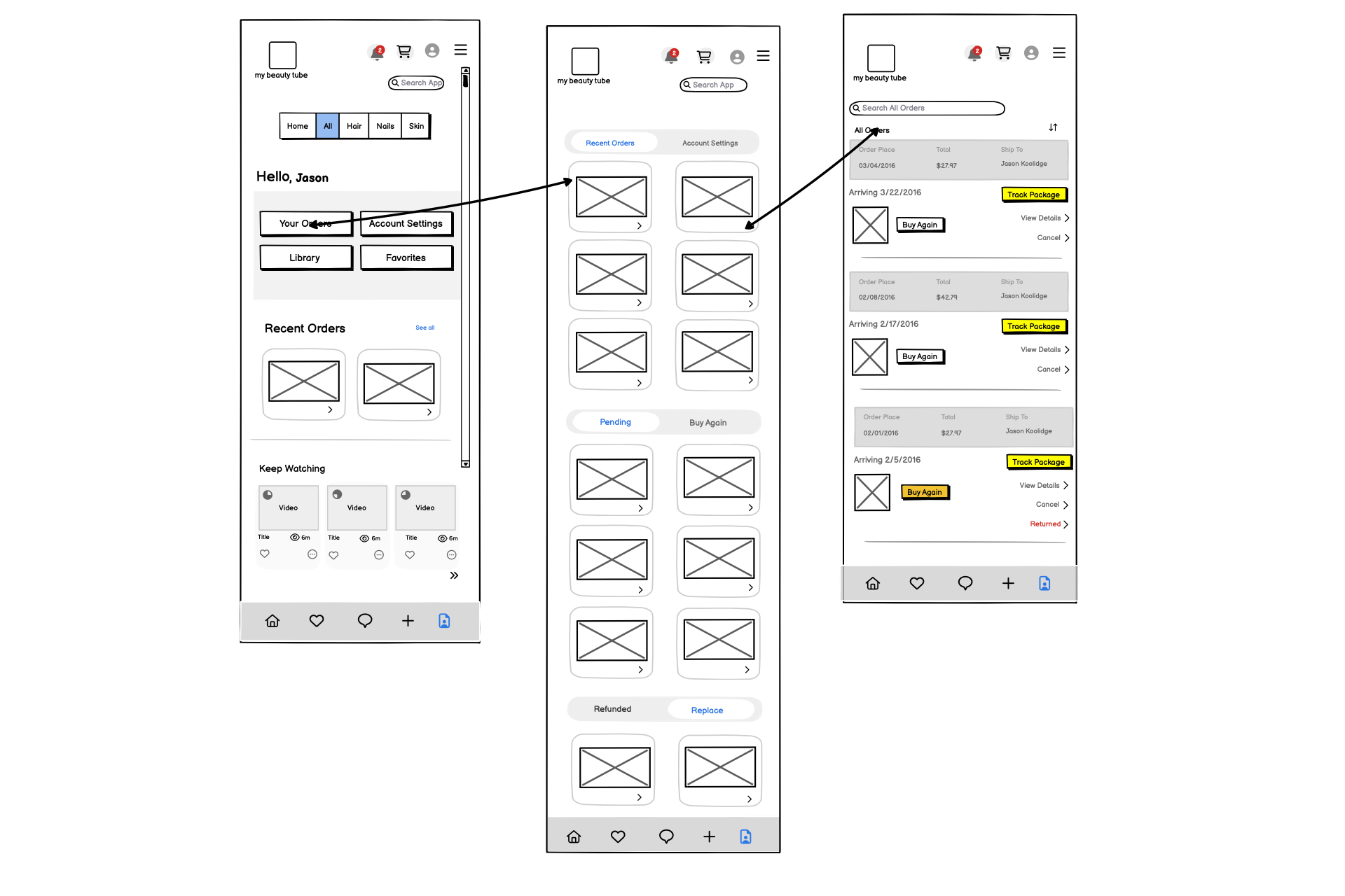
Designing the Account Management Flow for Enhanced User Engagement Overview
Centralized Navigation:
At the bottom of the app, users find a dedicated menu for account-related actions. This menu includes direct links to their orders, settings, library, and favorites, ensuring that all essential functionalities are just a tap away.
Order Management:
The primary interface of the account section features a snapshot of recent orders and a comprehensive link to view all orders. This section is designed to give users a quick overview while also allowing deeper dives into detailed order histories.
Progressive Engagement:
Below the order information, the app prominently displays a list of videos under the "Keep Watching" category, each with a progress bar. This design choice is strategic, leveraging incomplete actions to encourage users to return and engage with content. All videos show a progress bar, driving user interest and completion rates.
Detailed Order Interaction:
When users select 'Your Orders', they are directed to a screen that categorizes orders by status—recent, pending, buy again, refunded, or replaced—using a tabbed interface for easy navigation. Each order summary provides detailed options like tracking the package, viewing receipts, or canceling orders within a permissible window.
Enhanced Search and Reorder Functions:
Users can search for orders by number or keywords and sort them by recent activity. A 'Buy Again' feature simplifies repeat purchases, and any returns are clearly marked, enhancing transparency and trust.
This section focuses on the "Account Management Flow," where users interact with various aspects of their account, including order tracking, video library management, and settings. The design aims to streamline user interactions and enhance engagement by making account management intuitive and easily accessible.
Key Features and Design Decisions
Conclusion
The "Account Management Flow" wireframe aligns with our commitment to creating a user-centric platform that not only meets but anticipates user needs. By integrating intuitive navigation, progressive engagement strategies, and comprehensive order management features, we aim to ensure a seamless and engaging user experience that promotes loyalty and continuous interaction within the app.
Login Flow
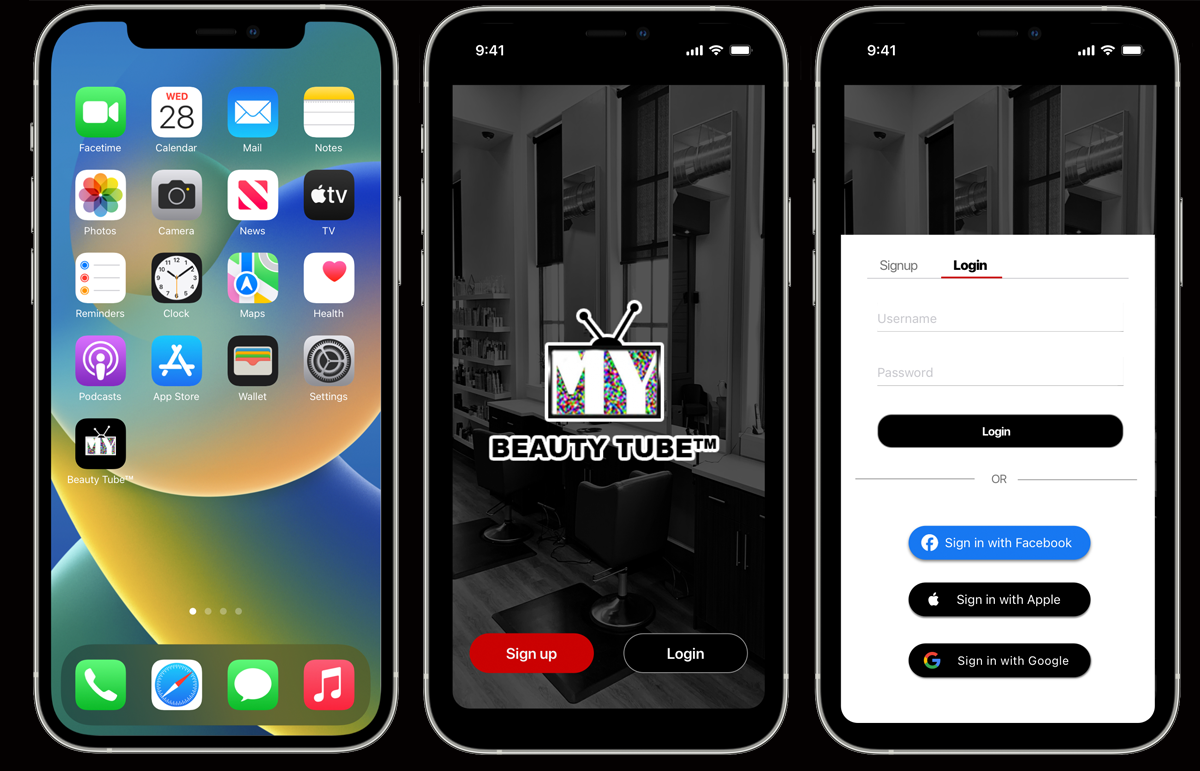
Multiple Sign-In Options:
Users can log in through social media platforms like Facebook, Google (Gmail), or Apple, providing a familiar and convenient way to access their accounts. Additionally, the app supports traditional email-password authentication for those who prefer a more straightforward approach. This flexibility helps reduce friction during sign-in and accommodates diverse user preferences.
Account-Based User Data:
By signing in with a personal account, users can maintain their library, track progress, and save their history within their own unique profiles. This ensures that user-specific data, such as watched videos and progress indicators, is retained, allowing for a personalized experience each time they use the app.
Clear Error Handling and Smooth Transition:
In case of sign-in issues, clear error messages are displayed, guiding users to resolve any authentication problems. Once signed in, users experience a seamless transition to the app's main interface, where they can immediately engage with content and access their personalized data.
Optimized Login Flow with Multi-Option Authentication
The login process in the app is designed with a focus on flexibility and personalization, allowing users to sign in using various methods. This approach enhances the user experience by offering multiple pathways to authentication.
- This multi-option authentication strategy supports a user-centric approach, ensuring ease of access and continuity of user data while promoting a consistent and efficient user experience.
Home Screen Overview for My Beauty Tube™ App
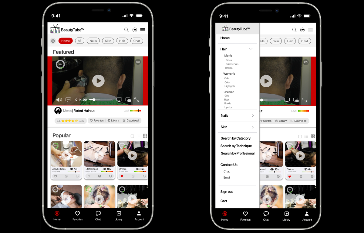
Video Progress and Interaction
Each instructional video on the Home Screen features a progress bar, providing users with a quick visual cue to track their viewing progress. This feature aims to encourage continued interaction with the app by letting users know which videos they've started or completed. Additional video metadata includes ratings and levels of difficulty, allowing users to make informed choices about which content to engage with.
Navigation and Content Organization
The Home Screen uses a two-tiered navigation system for content discovery. At the top, a horizontal navigation bar provides links to high-level categories such as Hair, Nails, and Skin. A more detailed vertical sidebar offers granular submenus that dynamically expand when users select a top-level category. For example, clicking "Hair" will reveal a list of subcategories like "Styling," "Coloring," and "Treatments."
User Preferences and Content Curation
The app's Home Screen is designed to reflect user preferences through a Favorites section, which employs algorithms to recommend videos based on user interactions and likes. This section enables users to quickly access their favorite content while promoting engagement with similar videos.
Library and Content Hierarchy
The Library section serves as a centralized location where users can find a curated list of videos they intend to watch, providing a convenient way to organize and access content. The videos are arranged in a specific hierarchy on the Home Screen, with "Featured" videos displayed prominently at the top, followed by "Most Popular," then categories such as Hair, Nails, and Skin.
User Engagement and Social Proof
To foster user engagement, the Home Screen displays the number of views for each instructional video, offering a form of social proof. This feature is intended to build community and trust among users, encouraging them to explore and engage with popular content.
Overall, the Home Screen balances usability with an engaging and personalized user experience, guiding users through a well-structured navigation system and providing clear indicators of progress and popularity.
The Home Screen is the initial interface users encounter after logging into the My Beauty Tube™ app.
This screen is designed with a focus on engagement, personalization, and intuitive navigation.
Shopping Cart & Chat Feature
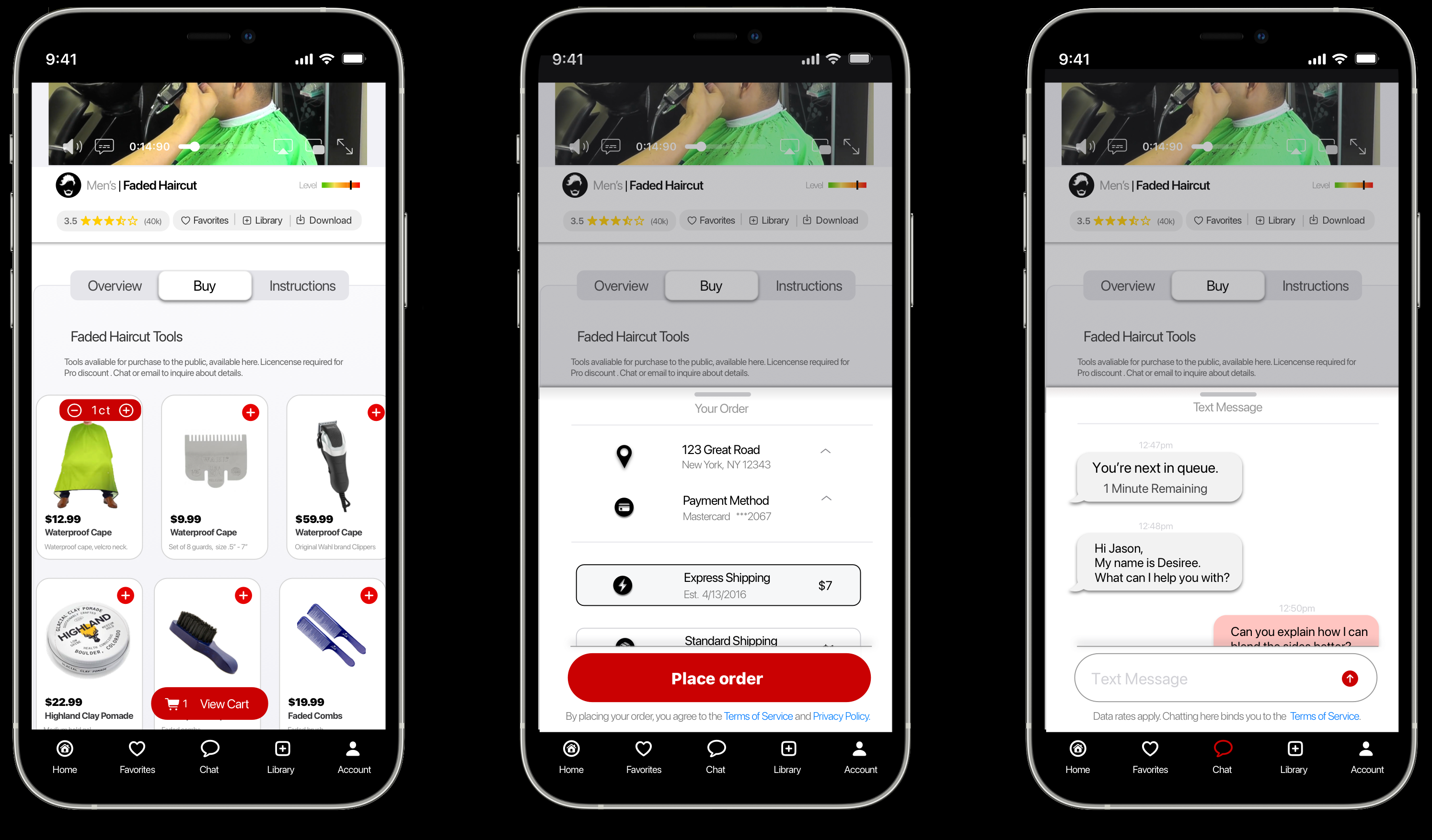
Overview Tab:
The Overview tab provides comprehensive insights into the instructional video content, including details about the instructor, their credentials, and a concise overview of the content. It ensures users are fully informed before delving into the learning experience.
Buy Tab:
Simplifying the shopping journey. The Buy tab presents featured tools from the video in an intuitive layout, allowing users to add items to their cart with ease. With a few clicks, users can navigate through the purchase process seamlessly, reflecting our commitment to enhancing the shopping experience.
Instructions Tab:
Empowering users with knowledge. The Instructions tab offers clear, step-by-step guidance for mastering the skills demonstrated in the video. It ensures accessibility for all users, providing visual and written instructions to accommodate different learning preferences. It's about inclusivity and empowerment, ensuring every user can engage with the content effortlessly.
Integrated Chat Feature:
Our integrated chat feature provides a direct line of communication within the app, connecting you with instructors and representatives. Whether seeking clarification on video content, assistance with your order, or engaging in insightful instruction, the chat feature ensures seamless connectivity and personalized support.
Purchasing and Support Interface
Discover three essential tabs: Overview, Buy, and Instructions. Each tab is thoughtfully designed to enhance user engagement and streamline the user experience, embodying the principles of user-centric design. Additionally, an integrated chat feature provides seamless communication for clarifications or assistance, ensuring a comprehensive and user-friendly experience.
In accordance with the terms of our Non-Disclosure Agreement, specific details pertaining to the proprietary components of the pay-review structure and operational mechanisms are confidential. These elements are integral to the unique functionality of the system and, as such, cannot be publicly disclosed or discussed. This confidentiality is essential to maintain the integrity and competitive advantage of the proprietary technology and processes involved

